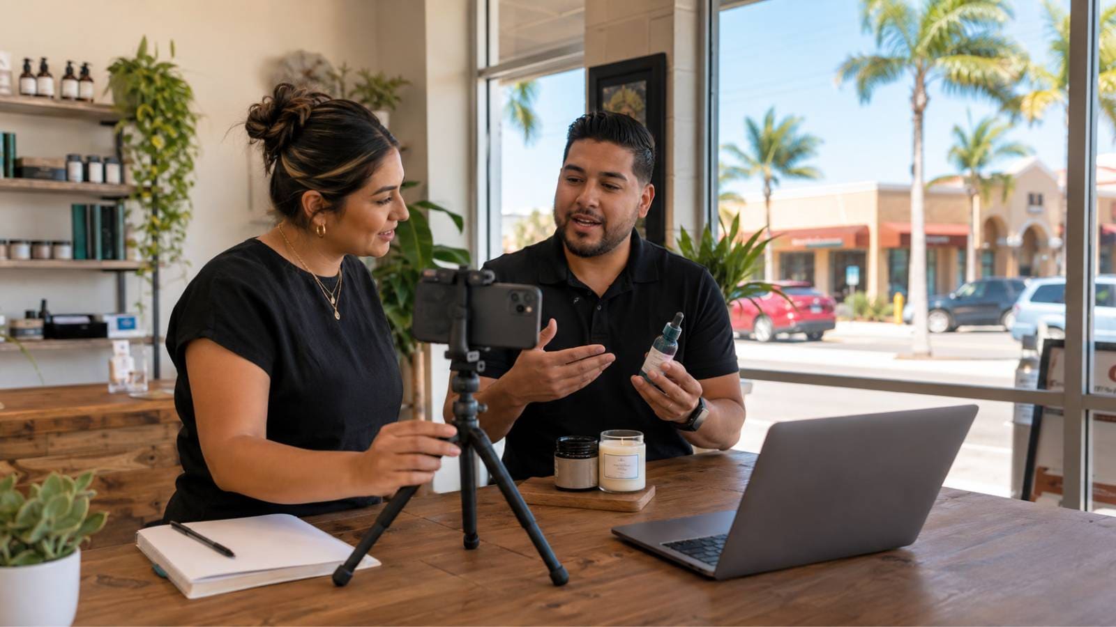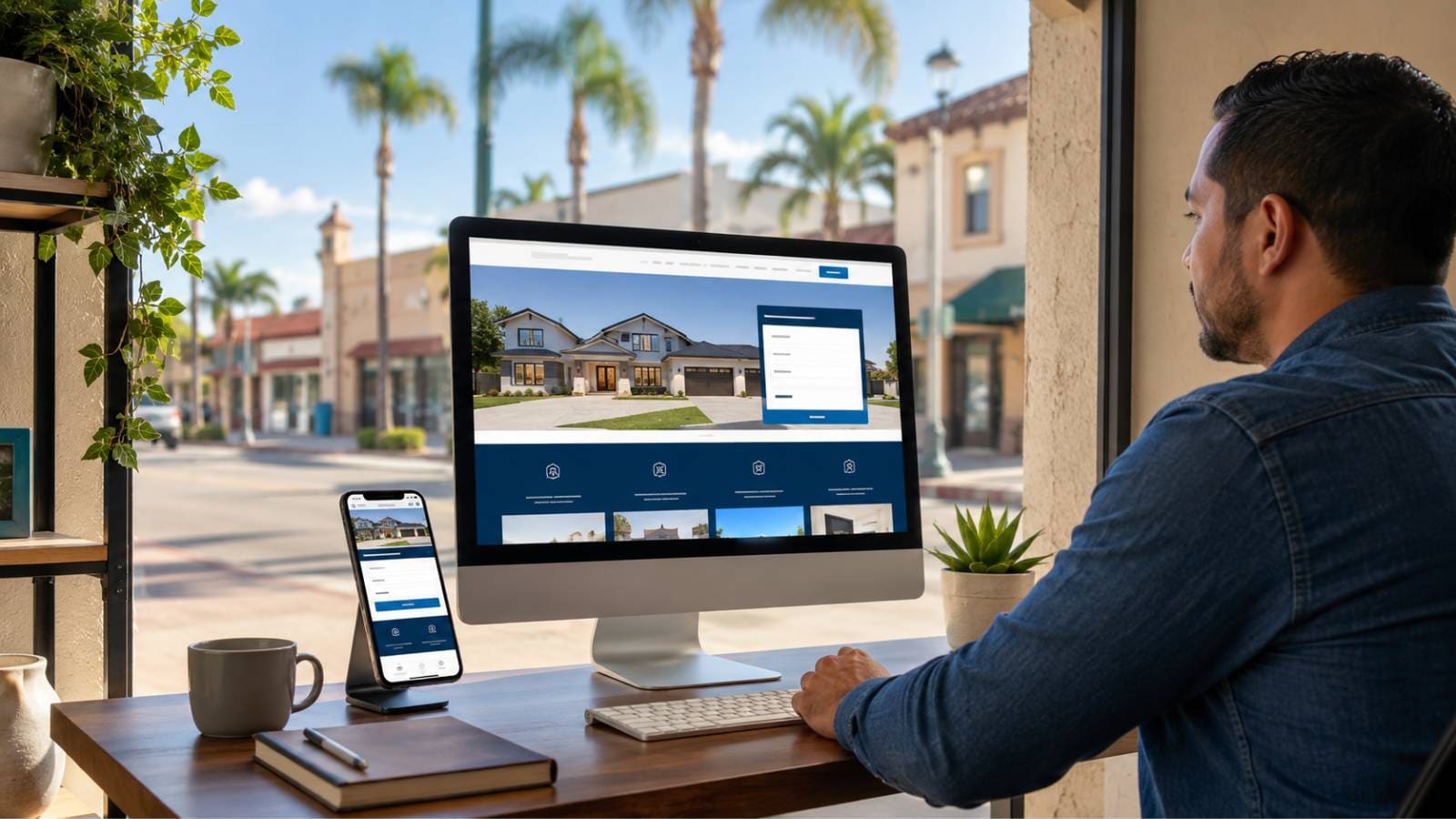
A good website should not just look modern. For a Rio Grande Valley business, it should help real people understand what you offer, trust that you are credible, and take the next step without confusion. That next step might be a phone call, a quote request, a financing application, a booked appointment, a directions click, or a form submission. The design should support the business outcome.
That distinction matters because many local websites are still built like digital brochures. They explain who the company is, show a few services, add a contact page, and stop there. In 2026, that is not enough. Customers are comparing businesses quickly, often from their phones, often while they are in between errands, at work, or searching from a nearby city. If your website is slow, vague, hard to navigate, or unclear about the next step, visitors may not complain. They simply leave and choose someone else.
For businesses in McAllen, Edinburg, Mission, Pharr, Weslaco, Harlingen, Brownsville, and the broader Valley, the opportunity is straightforward: build a website that feels local, loads quickly, answers the right questions, and makes it easy to convert. A polished design helps, but conversion comes from clarity, trust, and a user experience that respects how local customers actually search.
Why Website Design Matters More in a Local Market Like the RGV
The Rio Grande Valley is not a small, isolated market. The four-county region of Hidalgo, Cameron, Starr, and Willacy has more than 1.4 million residents, and incorporated RGV communities reached about 1 million residents in 2025 according to reporting based on U.S. Census estimates. That creates a serious local market for service providers, medical offices, dealerships, restaurants, contractors, legal firms, home services companies, professional services, and growing local brands.
At the same time, the Valley is not one single buyer persona. A customer in McAllen may compare options differently than someone in Brownsville. A family in Weslaco may care about convenience and Spanish-language communication. A business owner in Edinburg may be looking for a vendor who understands both professionalism and local relationship-building. A strong website design accounts for those local differences without turning every page into keyword stuffing.
The best RGV websites usually do three things well:
- They establish trust quickly. Visitors can tell what the business does, where it serves, and why it is credible within seconds.
- They reduce friction. Calls, forms, directions, financing, booking, and quote requests are easy to find on mobile and desktop.
- They support local discovery. The site gives Google and customers clear information about services, locations, service areas, reviews, and real expertise.
A business can have good word of mouth and still lose leads online if the website does not support the way people search today.
Start With the Visitor, Not the Design Trend
A modern website should look current, but the design process should not start with colors, animations, or competitor screenshots. It should start with the visitor's intent. What brought someone to the site? What do they need to know before they call? What objections are likely holding them back? What action does the business want them to take?
For an RGV service business, the intent may be urgent. A homeowner searching for AC repair in Mission wants fast help and proof that the company serves their area. A patient looking for a clinic in McAllen wants services, insurance information, hours, location, and an easy way to schedule. A customer comparing used vehicles in Harlingen wants inventory, financing options, location details, and reassurance that the process will be straightforward.
A conversion-focused website turns those questions into page structure. The homepage should not try to say everything at once. It should guide the visitor through a simple path: what you do, who you help, why you are trusted, where you serve, and how to take the next step.
BRT recommendation: Before designing a page, write down the top three visitor questions and the primary conversion action. If the design does not answer those questions or support that action, it is decoration rather than strategy.
Make the First Screen Clear on Mobile
For many local businesses, the mobile version of the website is the real website. Desktop still matters, especially for B2B and higher-consideration purchases, but many local searches happen on phones. That means the first screen must do heavy work.
A visitor should be able to understand four things immediately:
- What the business does.
- What city or service area it serves.
- Why the visitor should trust it.
- What to tap next.
This is where many small business websites fail. The hero section may include a vague slogan, a stock image, and a button that says "Learn More." That looks clean, but it does not help a visitor who is ready to call, book, or request a quote. For a local business, a stronger hero section might include a specific service message, a clear geographic reference, a credibility cue, and a direct call-to-action button.
For example, instead of "Quality Service You Can Trust," a home services company might say: "AC Repair and Maintenance for McAllen and Mission Homeowners." Instead of one generic button, the page might include "Call Now" and "Request Service." The wording is simple, but it tells the visitor they are in the right place.
Build Trust Before Asking for the Lead
People do not convert only because a button is visible. They convert when the page gives them enough confidence to act. In the Rio Grande Valley, trust is especially important because many buying decisions are influenced by reputation, referrals, family recommendations, and local familiarity. A website should reinforce those signals.
Useful trust elements include:
- Recent reviews or review summaries from real platforms.
- Local photos instead of generic stock imagery whenever possible.
- Clear address, service area, hours, phone number, and contact options.
- Team, owner, or staff information when appropriate.
- Real project examples, case stories, or completed work.
- Credentials, certifications, licenses, or affiliations that matter to the customer.
Make Conversion Actions Obvious, and Keep Forms Honest
Conversion actions should appear naturally throughout the site, especially after sections that answer key questions. Tap-to-call numbers, request-service forms, financing applications, booking links, directions, and lead magnets like audits, estimates, or pricing guides all belong above the fold and at natural decision points, not buried in a single contact page.
Website forms are a balancing act. Ask for too much information and visitors may abandon the form. Ask for too little and the lead may be hard to qualify. For a simple service request, name, phone, service type, city, and a short message may be enough. For a higher-ticket B2B consultation, it may make sense to ask for company name, website, service interest, and budget range.
A smart RGV website also accounts for bilingual communication preferences. Not every business needs a fully bilingual site, but many should consider Spanish-language CTAs, Spanish FAQ content, or a simple "Se habla español" trust cue when true. That small detail can reduce friction for local visitors who prefer to communicate in Spanish.
Speed and Mobile Performance Are Conversion Features
For local businesses, speed issues often come from oversized hero images, too many plugins, uncompressed video, bloated scripts, or templates that were built for appearance rather than performance. These issues are especially painful on mobile connections.
A performance-minded redesign should include:
- Compressed images sized appropriately for desktop and mobile.
- Clean code and minimal unnecessary scripts.
- Fast hosting and caching where appropriate.
- Testing important templates, not just the homepage.
- Tracking Core Web Vitals data in Google Search Console after launch.
A website does not need to chase vanity scores at the expense of business clarity. But it should be fast enough that users can comfortably browse, compare, and contact the business.
Use Local Proof, Not Generic Marketing Claims
Many websites sound the same because they rely on generic language: "best service," "trusted team," "customer-first approach," and "high-quality solutions." Those phrases are not wrong, but they are not persuasive on their own. Local visitors need proof.
Better proof might include a project completed in Edinburg with a short explanation of the problem solved, before-and-after photos from a Brownsville job, a client story from a McAllen office, or a short video from a Harlingen technician. Specificity is more credible than superlatives.
Design Landing Pages for Paid Ads Separately
Many businesses send Google Ads or social ads traffic to the homepage. Sometimes that works, but often it wastes budget. Paid traffic usually needs a more focused landing page with a specific message, a tighter CTA, and fewer distractions.
For example, if an RGV business runs an ad for "emergency plumbing in McAllen," the landing page should not make the visitor hunt through a general services page. It should confirm the service, show the service area, explain response expectations, provide proof, and make the call or request-service action obvious.
Website design should therefore include a landing-page system, not just standard website pages. That allows the business to test offers, cities, services, and CTAs without rebuilding the whole site every time.
Do Not Ignore Analytics, Call Tracking, and Lead Attribution
If a redesign launches without analytics, conversion events, call tracking, and basic attribution, the business is flying blind. Install GA4, configure key conversions (form submits, phone calls, booking actions, directions clicks), and connect the dots between marketing channels and revenue. Otherwise every future decision becomes a guess.
Common Mistakes in RGV Business Websites
- Designs built for the owner, not the customer. Pretty pages that bury the next step.
- Thin service pages that list services but don't explain them.
- No conversion tracking, the business can't tell which pages or campaigns are working.
- Hidden trust signals, reviews, credentials, real photos, and process details missing or buried.
A redesign is the right time to fix these issues before they become expensive marketing problems.
What a Strong RGV Business Website Should Include
- A clear homepage message tied to the main service and local market.
- Mobile-first calls to action, phone, form, directions, or booking.
- Dedicated service pages for the most important revenue drivers.
- Local service-area information written for people, not just search engines.
- Real reviews, testimonials, photos, work examples, or other proof.
- Fast-loading pages with clean technical performance.
- Basic accessibility considerations, readable text, contrast, labels, logical headings.
- Analytics and conversion tracking installed correctly.
- A content system that makes future updates easier.
This is how a website becomes more than a digital brochure. It becomes a local sales asset.
Final Takeaway
Rio Grande Valley businesses do not need websites that simply look nice. They need websites that help local visitors feel confident, understand the offer, and take action. The design should reflect the market, support local SEO, load quickly on mobile, and make conversion paths easy to follow.
If your current website is hard to update, unclear on mobile, slow to load, or not generating enough calls and leads, a redesign may be more than a visual upgrade. It may be a chance to rebuild the foundation of your local marketing.
Want a website that looks professional and supports real lead generation? BRT Digital can help Rio Grande Valley businesses plan, redesign, and optimize websites built for local visibility and conversions. Request a website audit or schedule a consultation to review what your current site is missing.